目的
记录CSS的知识点,方便查阅
基本概念
标准模式&混杂模式
- 在标准模式中,浏览器根据规范呈现页面;
- 在混杂模式中,页面以一种比较宽松的向后兼容方式显示,混杂模式通常模拟老式浏览器的行为防止老站点无法工作
技巧
- 使用特殊符号开头作为注释,避免找选择器时找到样式内容里去。比如以@开头
1 | /* @body styles */ |
选择器
类别
id选择器(#id)
- 类选择器(.class)
标签选择器(p)
相邻选择器(h1+p)(h1的下一个元素且它为p)
相邻兄弟选择器(B~E) (B元素后面的拥有共同父元素的兄弟元素E)
子选择器(li > a)
后代选择器(li a)
通配符选择器(*)
属性选择器
简单的属性选择
- 选择有class属性(值不限)的所有p元素
p[class] - 对所有带有alt属性的图形:
img[alt]
- 选择有class属性(值不限)的所有p元素
根据具体属性值选择
a[href="https://www.google.com"]
根据部分属性值选择
类型 描述 [attr] 带有以 attr 命名的属性的元素 [attr=value] 表示带有以 attr 命名的,且值为”value”的属性的元素 [attr~=value] 表示带有以 attr 命名的属性的元素,并且该属性是一个以空格作为分隔的值列表,其中至少一个值为”value” [attr|=value] 表示带有以 attr 命名的属性的元素,属性值为“value”或是以“value-”为前缀。 典型的应用场景是用来来匹配语言简写代码(如zh-CN,zh-TW可以用zh作为value) [attr^=value] 表示带有以 attr 命名的,且值是以”value”开头的属性的元素 [attr$=value] 表示带有以 attr 命名的,且值是以”value”结尾的属性的元素 [attr*=value] 表示带有以 attr 命名的,且值包含有”value”的属性的元素 1
2
3<div lang="zh-CN">世界您好!</div>
<div lang="zh-TW">世界您好!</div>
<div data-lang="zh-TW">?世界您好!</div>1
2
3
4
5
6div[lang|="zh"] {
color: red;
}
div[data-lang="zh-TW"] {
color: purple;
}
伪类选择器
a:link, a:visited, a:hover, a:active
根选择器, :root{…}【等价于:html {}】
not,input:not([type=”submit”])
:target
1
2
3
4
5
6
7<style>
#test:target {
background: yellow;
}
</style>
<a href="#test">跳到标题一</a>
<h1 id="test">标题一</h1>点击a链接后,页面跳到h1处,且h1背景变为黄色
E:first-child:选择作为第一个子元素的E元素,:last-child与之同理
E:nth-child(f(n)):f(n)是关于n的表达式,n的值从0开始直到再无匹配元素。
选择同一层第f(n)个元素且为E元素。(子元素序号从1开始),:nth-last-child(f(n))与之同理
E:nth-of-type(f(n)):f(n)同上。选择同一层第f(n)个类型为E的元素
同样有:nth-last-of-type(f(n)),:first-of-type,:last-of-type
:enabled、:disabled:针对表单可用和不可用状态设置样式
:checked:用于已选中的checkbox, radio, select
选择器优先级
- !important > 内联样式 > id > class > tag
- 权重
- id:100
- class,属性选择或伪类:10
- tag:1
- 结合符和通配符“*”以及”:not()”没有任何的加分权。
- 对于行内样式,加为“1,0,0,0”
- 对于”!important”加分高于上面的一切,将变成“1,0,0,0,0”
1 | ul li { |
1 | <style> |
Sausage是蓝色,主要是他们作用的是不在同一个元素之上
边框
border-style
1 | border-style:[ none | hidden | dotted | dashed | solid | double | groove | ridge | inset| outset ]{1,4} | inherit (可以分别使用不同样式,按照上右下左) |
阴影box-shadow
1 | box-shadow: offset-x, offset-y, blur-radius, extend-radius, color, [inset/outset]; |
- 投影方式:可选。inset为内部投影,默认外部投影
多个阴影
1 | .box_shadow{ |
边框应用图片border-image
使用 border-image 时,其将会替换掉 border-style 属性所设置的边框样式。
round会压缩(或伸展)图片大小使其正好在区域内显示,而repeat是一直接重复的


颜色
rgba(R,G,B,A)
R、G、B三个参数,正整数值的取值范围为:0 - 255。百分数值的取值范围为:0.0% - 100.0%。超出范围的数值将被截至其最接近的取值极限。并非所有浏览器都支持使用百分数值。A为透明度参数,取值在0~1之间,不可为负值
渐变
1 | background-image:linear-gradient(to left, red, orange,yellow,green,blue,indigo,violet); |
字体
font-style
1 | font-style:italic(斜体) | oblique(倾斜) | normal | inherit,默认值是normal |
font-variant
1 | font-variant:small-caps | normal | inherit |
- small-caps:小型大写字母原来大写依旧大写,原来小写变成小个的大写
@font-face
1 | @font-face { |
文本属性
text-indent
- 缩进文本
1 | text-indent:<length> | <percentage> | inherit |
text-decoration
1 | text-decoration: <'text-decoration-line'> || <'text-decoration-style'> || <'text-decoration-color'> |
- underline:下划线
- overline:上划线
- line-through: 横穿线
- none:啥线也没有
- 参考链接:https://developer.mozilla.org/zh-CN/docs/Web/CSS/text-decoration
字间隔和字母间隔
- 字间隔:word-spacing
- 字母间隔:letter-spacing
white-space
1 | white-space:normal | nowrap | pre | pre-wrap | pre-line | inherit |
- normal,也就是丢掉多余的空白符(空格、换行和tab字符)
- pre:空白符不会被忽略(浏览器中不会自动换行)
- nowrap:防止元素中的文本换行,除非使用br元素
- pre-wray:保留空白符,正常地换行(指的是到达浏览器边界自动换行)
- pre-line:合并空白符(保留换行符),正常地换行(同上)
text-transform
- uppercase和lowercase将文本转换为全大写或者全小写
- capitalize只对每个单词的首字母大写
direction
1 | direction:ltr | rtl | inherit |
- ltr:左对齐
- rtl:右对齐
text-overflow
实现溢出文本显示省略号的效果
1 | text-overflow:ellipsis; |
word-wrap
设置文本行为,当前行超过指定容器的边界时是否断开转行
1 | word-wrap: normal | break-word; |
normal:默认
break-word:在长单词或 URL地址内部进行换行
text-shadow
文本的阴影
1 | text-shadow: X-Offset Y-Offset blur color; |
浮动和定位
float
- 依旧是文档流中的一部分,不像absolute脱离文档流
- 可以取值left, right, none, inherit
- 如果父级元素内只有浮动元素,会发生坍塌。可以通过清除浮动解决
- 一个浮动元素会尽可能靠近父级元素的top和left/right
z-index
- 只对position不是static(默认)的元素生效
- 如果元素B堆叠在元素A的上方,那么元素A中的任意子元素都不可能堆叠在元素B的上方
- 相邻兄弟元素才可以直接通过z-index比较前后,如果不是,则看父元素
表布局
border-collapse
| 值 | 描述 |
|---|---|
| separate | 默认值。边框会被分开。不会忽略 border-spacing 和 empty-cells 属性。 |
| collapse | 如果可能,边框会合并为一个单一的边框。会忽略 border-spacing 和 empty-cells 属性。 |
| inherit | 规定应该从父元素继承 border-collapse 属性的值。 |
分隔单元格边框
border-spacing
指定相邻单元格边框之间的距离。相当于 HTML 中的 cellspacing 属性,第二个可选的值可以用来设置不同于水平间距的垂直间距。设置在table中,如果设置在td会被忽略
1 | border-spacing:horizontal [vertical] | inherit; |
border-collapse
用来决定表格的边框是分开的还是合并的
1 | border-collapse: collapse(合并) | separate(默认) | inherit; |
列表
list-style-type
- 列表类型
1 | list-type: disc | circle | square | decimal | decimal-leading-zero | upper-alpha | lower-alpha | lower-roman | upper-roman | lower-greek | lower-latin | |
list-style-image
- 列表项图像
1 | li {list-style-image: url(ohio.gif);} |
list-style-position
- 列表项标志位置
1 | list-style-position: inside | outside | inherit; |
outside:默认样式
inside:相当于列表标志作为li的内容
list-style
- 上面3者的简写
1 | list-style: <list-style-type> || <list-style-image> || <list-style-position> |
CSS计数器
参考链接:https://developer.mozilla.org/zh-CN/docs/Web/Guide/CSS/Counters
媒体查询
媒介类型
| 类型 | 描述 |
|---|---|
| screen | 彩色计算机显示 |
| 打印(分页式媒体) | |
| projection | 投影 |
| all | 所有媒体 (默认) |
1 | @media screen and (max-width:599px) { |
1 | <link rel="stylesheet" type="text/css" href="style.css" media="screen" /> |
背景
background-origin
设置元素背景图片的原始起始位置
1 | background-origin : border-box | padding-box | content-box; |

background-clip
将背景图片做适当的裁剪
1 | background-clip : border-box | padding-box | content-box | no-clip |

background-size
设置背景图片的大小,以长度值或百分比显示,还可以通过cover和contain来对图片进行伸缩
1 | background-size: auto | <长度值> | <百分比> | cover | contain |
1、auto:默认值,不改变背景图片的原始高度和宽度;
2、<长度值>:成对出现如200px 50px,将背景图片宽高依次设置为前面两个值,当设置一个值时,将其作为图片宽度值来等比缩放;
3、<百分比>:0%~100%之间的任何值,将背景图片宽高依次设置为所在元素宽高乘以前面百分比得出的数值,当设置一个值时同上;
4、cover:顾名思义为覆盖,即将背景图片等比缩放以填满整个容器,等比例放大直到容器被覆盖。
5、contain:容纳,即将背景图片等比缩放至某一边紧贴容器边缘为止。等比例放大直到有三条边接触到容器为止

background-attachment
1 | background-attachment: scroll | fixed | inherit |
scroll:默认值。背景图像会随着页面其余部分的滚动而移动
fixed:当页面的其余部分滚动时,背景图像不会移动
CSS3背景 multiple backgrounds
1 | background-image:url1,url2,...,urlN; //多重背景图可以是url()或gradient的混合方式 |
- 用逗号隔开每组 background 的缩写值
- 如果有 size 值,需要紧跟 position 并且用 “/“ 隔开
- 如果有多个背景图片,而其他属性只有一个(例如 background-repeat 只有一个),表明所有背景图片应用该属性值
- background-color 只能设置一个
变形 transform
rotate()
1 | transform: rotate(45deg); |
skew()
1 | transform: skew(30deg,10deg); |

scale()
1 | transform: scale(2); |
translate()
1 | transform: translate(-50%, -50%); |
matrix()
1 | transform: matrix(a,b,c,d,e,f); |
matrix(scaleX(), skewX(), skewY(), scaleY(), translateX(), translateY());
transform-origin
在没有重置transform-origin改变元素原点位置的情况下,CSS变形进行的旋转、位移、缩放,扭曲等操作都是以元素自己中心位置进行变形。但很多时候,我们可以通过transform-origin来对元素进行原点位置改变,使元素原点不在元素的中心位置,以达到需要的原点位置
1 | transform-origin: top right; |
动画 transition
CSS3的过度transition属性是一个复合属性,主要包括以下几个子属性:
transition-property:指定过渡或动态模拟的CSS属性transition-duration:指定完成过渡所需的时间transition-timing-function:指定过渡函数transition-delay:指定开始出现的延迟时间
transition-property

transition-timing-function

简写
1 | a{ transition: background 0.8s ease-in 0.3,color 0.6s ease-out 0.3;} |
动画 animation
keyframes
1 | @keyframes changecolor { |
其中0%和100%还可以使用关键词from和to来代表
animation
1 | div { |
animation-iteration-count
播放次数
1 | animation-iteration-count: infinite | <number> [, infinite | <number>]* |
其值通常为整数,但也可以使用带有小数的数字,其默认值为1,这意味着动画将从开始到结束只播放一次。
如果取值为infinite,动画将会无限次的播放
animation-direction
设置动画播放方向
1 | animation-direction:normal | alternate [, normal | alternate]* |
animation-play-state
控制元素动画的播放状态
有两个值:running和paused
1 | span { |
animation-fill-mode
定义在动画开始之前和结束之后发生的操作。主要具有四个属性值:none、forwards、backwords和both。其四个属性值对应效果如下
| 属性值 | 效果 |
|---|---|
| none | 默认值,表示动画将按预期进行和结束,在动画完成其最后一帧时,动画会反转到初始帧处 |
| forwards | 表示动画在结束后继续应用最后的关键帧的位置 |
| backwards | 会在向元素应用动画样式时迅速应用动画的初始帧 |
| both | 元素动画同时具有forwards和backwards效果 |
布局
外边距
对于行内非替换(inline)元素:
上下外边距对行高没有任何影响,能改变行间距离的只有line-height、font-size和vertical-align。左右外边距则会有影响
对于行内替换(inline-block)元素:
上下左右外边距都会产生影响!
内边距
内边距和行内非替换(inline)元素
上下内边距不影响行高,但背景会被延伸
左右内边距会起作用,挤开两边
对于行内替换(inline-block)元素
上下左右内边距都会产生影响
flex
注意
设为 Flex 布局以后,子元素的float、clear和vertical-align属性将失效
容器属性
flex-direction:row | row-reverse | column | column-reverse;【主轴方向,项目的排列方向】
flex-wrap:nowrap | wrap | wrap-reverse; 【换行方式,默认不换行】
flex-flow:
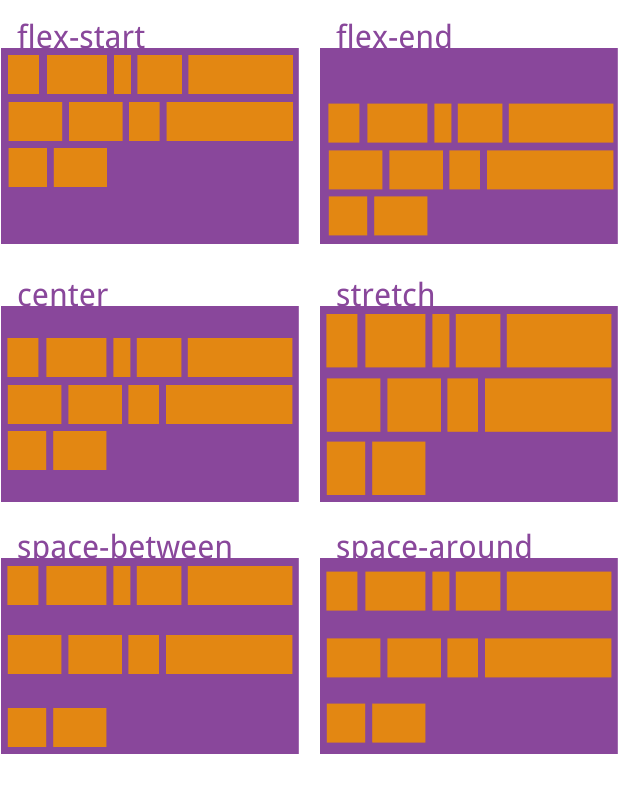
flex-direction属性和flex-wrap属性的简写形式,默认值为row nowrapjustify-content:flex-start | flex-end | center | space-between | space-around;【项目在主轴的对齐方式】
- space-between:两端对齐,项目之间的间隔相等
- space-around: 每个项目两侧的间隔相等。所以,项目之间的间隔比项目与边框的间隔大一倍。
align-items:flex-start | flex-end | center | baseline | stretch;【项目在交叉轴的对齐方式】
- baseline: 项目的第一行文字的基线对齐
- stretch(默认值):如果项目未设置高度或设为auto,将占满整个容器的高度
align-content:flex-start | flex-end | center | space-between | space-around | stretch;【定义了多根轴线的对齐方式,如果项目只有一根轴线,该属性不起作用】
子项目属性
- order:
<integer>; 【定义项目的排列顺序。数值越小,排列越靠前,默认为0】 - flex-grow:
<number>; 【项目的放大比例,默认为0,即如果存在剩余空间,也不放大】 - flex-shrink:
<number>;【项目的缩小比例,默认为1,即如果空间不足,该项目将缩小】 - flex-basis:
<length> | auto;【在分配多余空间之前,项目占据的主轴空间(main size)。浏览器根据这个属性,计算主轴是否有多余空间。它的默认值为auto,即项目的本来大小】 - flex:
flex-grow, flex-shrink 和 flex-basis的简写,默认值为0 1 auto。后两个属性可选。 - align-self:auto | flex-start | flex-end | center | baseline | stretch;【允许单个项目有与其他项目不一样的对齐方式,可覆盖
align-items属性。默认值为auto,表示继承父元素的align-items属性,如果没有父元素,则等同于stretch】
内容来源:http://www.ruanyifeng.com/blog/2015/07/flex-grammar.html
用户界面
定制光标
1 | a {cursor: url(xxx.gif), pointer;} |
在定制的语法中,URL必须跟有一个逗号和某个通用关键字
各种不同的光标:https://developer.mozilla.org/zh-CN/docs/Web/CSS/cursor
outline外轮廓属性
1 | outline: [outline-width] || [outline-style] || [outline-color] |
| 属性值 | 属性值说明 |
|---|---|
| outline-color | 定义轮廓线的颜色,属性值为CSS中定义的颜色值。在实际应用中,可以将此参数省略,省略时此参数的默认值为黑色。 |
| outline-style | 定义轮廓线的样式,属性为CSS中定义线的样式。在实际应用中,可以将此参数省略,省略时此参数的默认值为none,省略后不对该轮廓线进行任何绘制。 |
| outline-width | 定义轮廓线的宽度,属性值可以为一个宽度值。在实际应用中,可以将此参数省略,省略时此参数的默认值为medium,表示绘制中等宽度的轮廓线。 |
| outline-offset | 定义轮廓边框的偏移位置的数值,此值可以取负数值。当此参数的值为正数值,表示轮廓边框向外偏离多少个像素;当此参数的值为负数值,表示轮廓边框向内偏移多少个像素。 |
| inherit | 元素继承父元素的outline效果。 |
outline不影响点击事件区域
生成内容
通过CSS3的伪类“:before”,“:after”和CSS3的伪元素“::before”、“::after”来实现,其关键是依靠CSS3中的“content”属性来实现
content配合CSS的伪类或者伪元素,一般可以做以下四件事情:
| 功能 | 功能说明 |
|---|---|
| none | 不生成任何内容 |
| attr | 插入标签属性值 |
| url | 使用指定的绝对或相对地址插入一个外部资源(图像,声频,视频或浏览器支持的其他任何资源) |
| string | 插入字符串 |
1 | <a href="##" title="我是一个title属性值,我插在你的后面">我是元素</a> |
resize
允许你控制一个元素的可调整大小性
适用元素:overflow不为visible的元素
1 | resize: none | both | horizontal | vertical | inherit; |
如果一个block元素的 overflow 属性被设置成了
visible,那么resize属性对该元素无效
其他
- 为了提高页面的可访问性,在定义鼠标悬停状态时,最好在链接上添加
:focus伪类。在通过键盘移动到链接上时,这让链接显示的样式与鼠标悬停时相同。
1 | a:hover, a:focus {color: red;} |
移动端自适应
1 | // js自动确定缩放比 |
1 | // scss定义rem及px转换函数 |
参考链接
http://www.ruanyifeng.com/blog/2015/07/flex-grammar.html
https://developer.mozilla.org/en-US/docs/Web/CSS/Reference